Two years ago I started a personal project about vintage matchboxes which was a way for me to experiment with new styles and techniques. Even though it has been a wonderful challenge and I will still continue to make them, they’re a bit limited because of the format. That’s why I decided to see this as an opportunity to start a new personal project inspired by vintage apothecary packaging. I really enjoy to take inspiration from early XX century design so this was the perfect excuse to create something inspired by all these references. In this tutorial I’ll talk about my process and give you some tips on how to create vintage inspired packaging illustrations.
For this project I used my iPad Pro and Procreate, Photoshop and a Wacom tablet. You can also use pen and paper instead of the iPad so no worries if you don’t have one!
Even though I’m Portuguese, most of my work is in English so I decided to explore my native language and have fun with some traditional expressions by giving them a twist. The first step of this project was to write the copy for each label because the concept could lead me to some ideas for the execution.

Now that we’re ready the first thing to do is to find references. I started doing some research online using Flickr and Pinterest. Flea markets are also great places to seek inspiration because the things you’ll find will always be more unique than what is available online for everyone. Finding good references is super important, specially if you’re getting inspiration from a specific period of time, but my goal here wasn’t to replicate exactly what was made in the past so I tried not to get too attached to them.
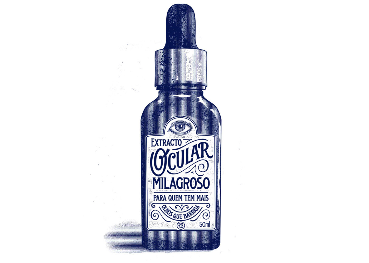
For this demonstration I picked the concept of an eye extract for people who have their eyes bigger than the belly (meaning they always put more food on the plate than they’re going to eat). I knew that I wanted to have the main name “Extracto Ocular ”, the tagline “Para quem tem mais olhos que barriga” and an illustration of an eye. It’s good to have different elements so you can play around with composition but try not to complicate things too much. I always start by making a rough sketch of what I envision the illustration to be. I begin with the container and then move to the label. There are so many beautiful examples of old bottles so try to pick one that has an interesting shape. The same applies for the label: you don’t have to be restricted to a simple rectangle. Try to have fun and play around with different shapes and sizes!
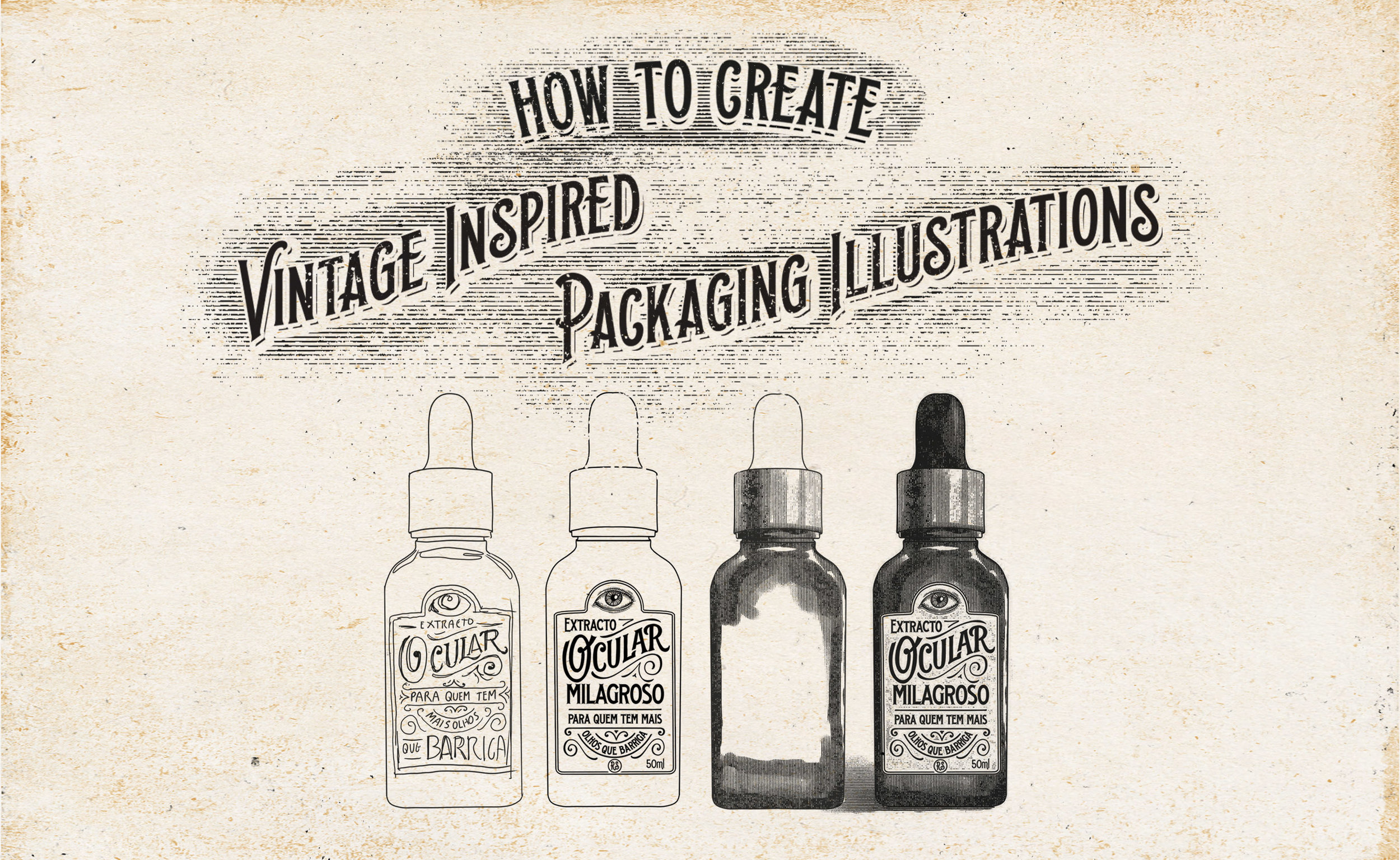
This part of the process is where you shouldn’t be too tied to your first idea. It’s important to let your imagination flow and to experiment with different styles and layouts. Something that I re-learned while working on this is that composition is the most important thing in design, specially if you’re working with a restricted area. You can have the most beautiful letters and illustrations but if the composition sucks and the hierarchy isn’t correct, the final result won’t be as good as it could be. For me, sketching on the iPad works very well because you can edit things quickly but you can do this with paper.
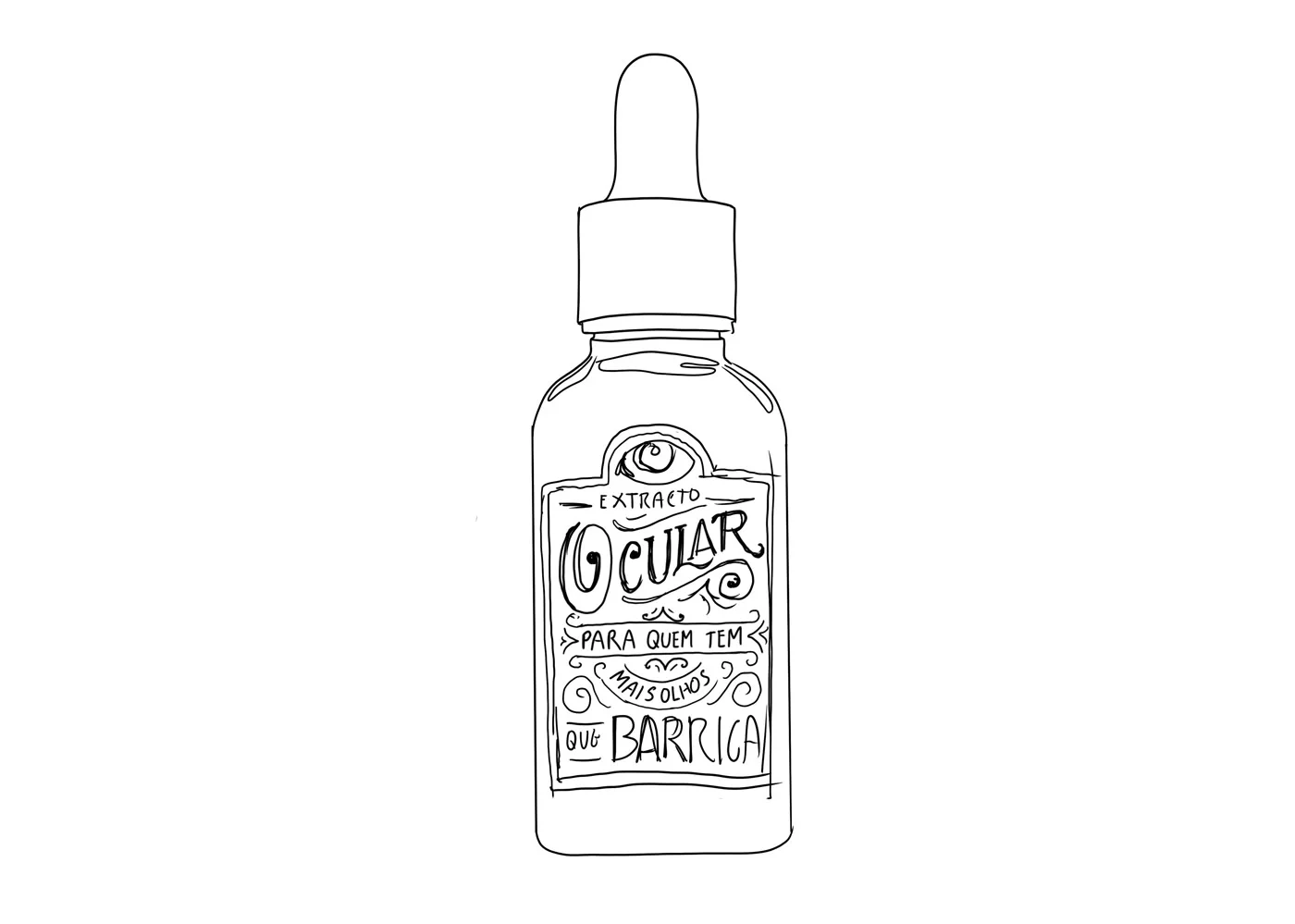
Once you’re happy with the sketch it’s finally time to start working on the final illustration. I continued to work on the iPad but you could to this using pen and paper or the computer ( Photoshop or Illustrator). Again, I started drawing the outlines of the bottle first (a good tip is to create half of the bottle and then mirror it) and then moved to the label. I ended up changing the composition a bit and adding a couple of new elements because I wasn’t happy with the overall balance. Sometimes things don’t work the way you want but it’s never too late to change things. For this label I mixed hand-lettering with existing fonts but you can either use just hand-lettering or only fonts.

After you finished drawing the label and the bottle you need to import everything to Photoshop. If you’re drawing on paper you can either scan or take a photo of the illustration and then remove the background. I like to keep everything in separate layers so I can quickly make adjustments without having to previously select the objects. It’s also during this step that I fix small spacing mistakes and move things around a little bit.
If you think you there’s nothing else you can do to improve the design it’s time to move to the fun part. I’m a big big fan of True Grit Texture Supply, and they have this amazing Halftone Brush pack that also has a couple of line brushes that I LOVE to use and are perfect for this type of illustration. The pack costs $19.00 but I couldn’t recommend their products enough. I like to use the Line2-Vert from the brush presets to shade the bottle. It will help if you have a pressure sensitive tablet (I use a Wacom Intuos Pro M) because you can play with the thickness of the lines but it’s not essential. I wanted the source of light to come out from the right so I shaded everything according to that. It’s also good if you have a good reference of a bottle so you can understand better how light reflects on glass.

You can also add a little bit of texture on the label and draw a shadow (use the horizontal line brush for this) so the bottle doesn’t look like it’s floating.
That should be it! If you want you can also play with colors but I personally like how it looks with just one color. You can see other illustrations I created using this technique here. Let me know if you have any questions about the process or tools, happy to answer in the comments!