I’ve been obsessed with neon signs for as long as I can remember. They were very popular between the 20s and the 60s but unfortunately are very hard to spot nowadays because there a lot more cheaper and easier solutions. But, even though there are plenty of alternatives, nothing comes close to the look of a neon sign.
The signs are created by bending glass tubing (while it’s extremely hot) into shapes which is a craft that takes a long time to master. These tubes are filled with rarefied neon or other gases that, with the help of the electric current, starts to shine. It’s incredible how they can be used for signage but also to create unique pieces of art. And they can last up to 40 years!
Fortunately for us, there are multiple ways we can recreate the look of a neon sign digitally. For this tutorial you’ll need a place to sketch; Procreate/Illustrator and Photoshop and some basic/intermediate knowledge of both softwares.
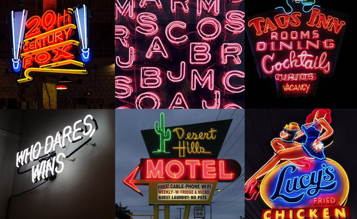
The first step is to look for references. If you look for signage you’ll see that a lot of options mix neon signs with other metal or plastic signs. However, for this tutorial, I’ll only be focusing on the actual neon signs. You can either go online or just go around where you live to see what you can find. I always take a picture when I find a sign that I like which is always a good idea if you like to get inspired by the real world. During this step it’s very important to pay attention to see what can be done when creating a neon sign. There are some limitations that you need to keep in mind if you want to achieve a realistic look. Each tube is always open ended, so for example the letter “O” needs to have an opening of both circles. Even though they can be very adaptable, you need to remember that these are glass tubes, so some tight angles and shapes will be hard to achieve.
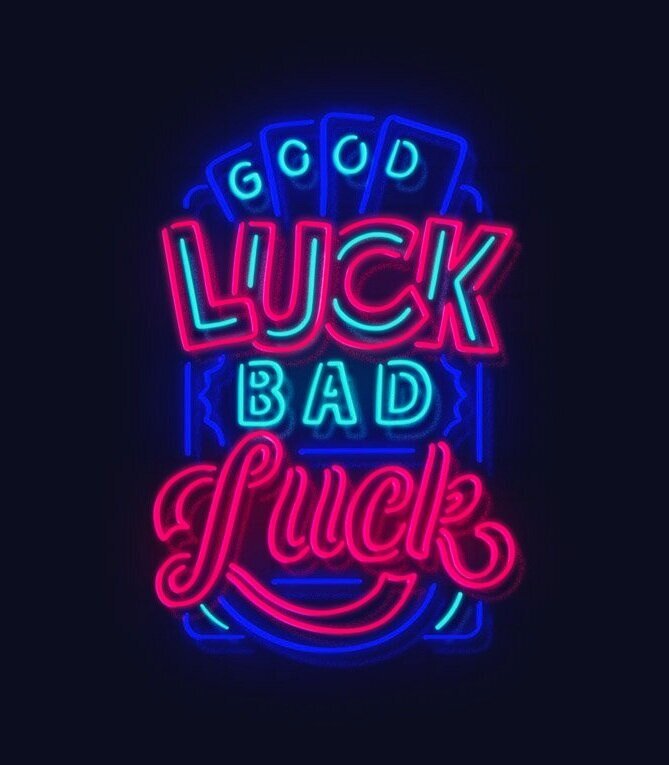
For this tutorial I’ll be creating a sign with the words “Good Luck Bad Luck” and a couple of additional elements.
These are all small words so I immediately started to imagine a more vertical composition. I can’t stress this enough but don’t worry if your sketches look terrible. Their purpose is to give you the freedom to explore even the most ridiculous ideas, not to look good! Don’t worry about color now, we’re just focusing on a composition. You can do a more complicated composition like this or try something more simple like one word or a simple illustration.

Now that you’re happy with the direction of the design, it’s time to create the elements you’ll need. I like to use Procreate (I used to do this in Illustrator) because it gives the illustration a more hand-made look. I always like to have small imperfections in my pieces and that approach works especially well here given that the neon tubes are bent by hand.
It’s best to use a dark background with a white brush so you can have a general idea of which brush weight that works best. There’s no rules here - if it feels and looks good, go with it! Just try to keep in mind the scale of the neon compared to what it would look in real life and that the end result will look thicker when you add the effects later in the process.
If you’re using Procreate, you already have the perfect brush for this - the Monoline brush (located in the calligraphy tab). When tracing your artwork remember to leave an open gap between shapes and to do each element (word/illustration) on a separate layer!

When you're happy with what you've got, it's time to import the layers into Photoshop. I always find it more intuitive to work on color using the computer but you can absolutely do this on your tablet (if you're working on one). Neon colors are really bright and saturated so, unless you're doing a really big composition, I would suggest limiting your palette to 1-3 colors. For this illustration I want to use blue, cyan and a strong magenta.

Colors are a huge help when you're trying to define hierarchy. For this composition it makes sense to use the same colors for the main words ("good"/"bad" and both "luck") because it will help define which words are more important. Sometimes this is easier to figure out but others it's just trial and error. Try to play with different combinations to see what works best but make sure your piece looks balanced by the end. It took a few tries but this is what I ended up with.
Now it's time to make this look like a real neon sign! I like to use a combination of layer style effects to make it more realistic. I don't have a specific preset that I use because I always ended up adjusting everything to make it look how I want. We're going to apply this to all the neon illustration layers so you can merge the layers with the same colors to make things easier. This are the settings I used for this piece.
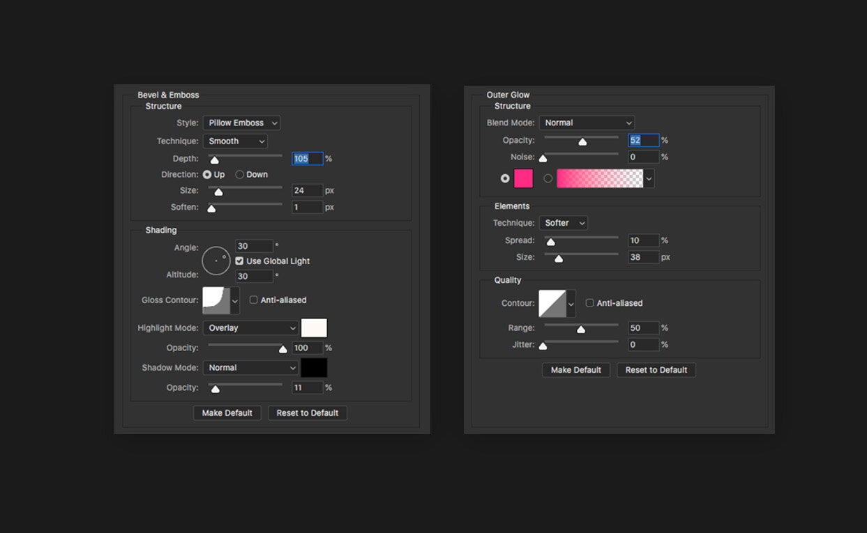
Apply the effect to all the layers (make sure your outer glow color is the same as your neon tube) and it will start to look more like a glass tube neon sign. Now copy all the layers and merge them. With this new layer go to Filter-Blur-Gaussian blur (with the radius around 25 or more) and put it under the main neon layers. Move it a bit on the X and Y axis so it looks like it's a reflection of the light on the wall. I like to set the blending mode on this layer to "Soft Light" and duplicate it a couple of times (your background can't be pure black otherwise it won't show). You can also add some noise (Filter-Noise-Add Noise) to add an extra texture.
Now we're talking! But there's more we can do. Grab a big soft round brush and paint some extra light (with the colors of your neons) so it spreads a bit more. Feel free to use Gaussian Blur to diffuse it more. Set the blending mode to "Soft Light" and set the opacity to around 50%. You can complement this with a couple of layers of the main neon illustration with a gaussian blur filter (with a big radius) using the “Soft Light” mode.
For the background I like to use a really dark shade of a color (here I used #0c0c1a) but not black. This allow us to add darker details if we want. A soft vignette also works really well around your canvas. To do this create a black layer, select a really big soft round brush and erase the center area. Set the blending mode to soft light and it should look good. You can also add a wall texture to make it look even more realistic.

There is much more you can do if you want to achieve a realistic look. If you pay close attention to a neon sign, you’ll see that some parts are hidden with black paint. The tube benders make this so they can use the same tube for multiple elements. You can also try to add some cables and fixtures to make it look even more realistic. Fake cables and a simple structure behind your neon sign will make it more realistic and, if you want, you can even animate your neon sign. The possibilities are endless!
Let me know if you have any questions in the comments. I know it's a lot of information so it can be overwhelming! Also feel free to share your neon illustrations or extra tips you might come across!