• Home
  • Work
  • Art
  • Blog
  • Contact
  • About
  • Shop
Menu

João Neves

  • Home
  • Work
  • Art
  • Blog
  • Contact
  • About
  • Shop
Composition-Cover.jpg

Composition 101: How to create balanced layouts for your lettering pieces

August 23, 2019

Whether if you’re just starting out your adventure in the lettering world or if you’re a seasoned expert, composition can always be an intimidating topic. Even though general people might not understand the importance of a good layout, it’s our job to make it work so well that it becomes unnoticeable.

Through the years I learned some techniques and tips that I think could be helpful for anyone who creates anything lettering related.

Selecting your quote

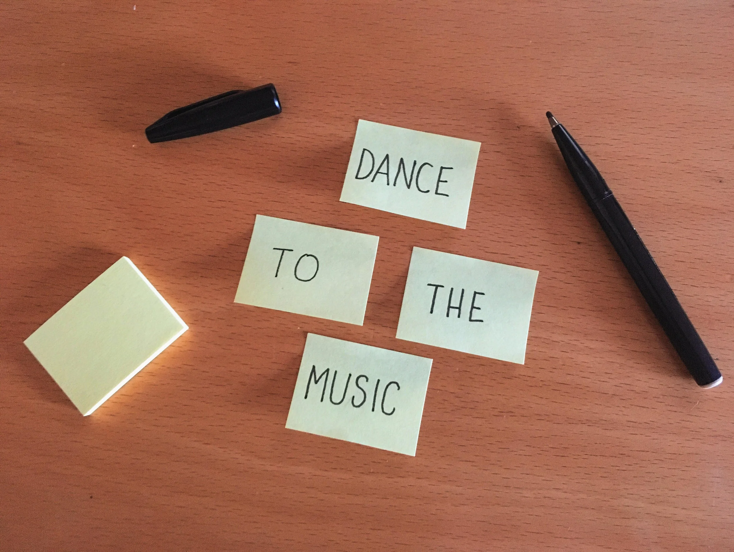
The first step is to obviously pick a quote. Usually the more words you have the more complicated it could be to find a good composition, but sometimes only a few words can also give you trouble. Once you have a quote you like it’s important to understand the flow so you know how you should split it. For example take the quote “Dance to the music”. The main words are “dance” and “music” so they should be the focus of the composition while “to the” can be smaller but still legible. This is why scale is so important. A good way to do this is to write it down on a piece of paper which will help you understand how each word moves to the next one. You can also cut small pieces of paper or use post-its for each word and then move things around.
unnamed.jpg

Shapes are your best friends

Now that you divided your quote in parts you can start having fun with the composition. For this step I would 100% recommend focusing on shapes rather than style. This is the most fun part because there’s an infinite number of possibilities you can have so it’s the time to let your imagination flow and have fun with just drawing.

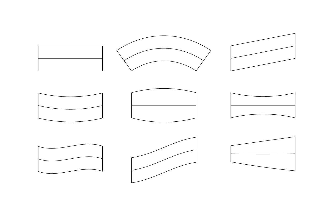
Below are some of the possible shapes you can insert your words on. Some shapes will work better together than others so now is when you should spend some time figuring out what’s the best combination for your quote. You can draw your words inside the shapes but again - focus just on if they fit the shape and the composition and not on the style. You can do this with just pen and paper or use any digital software which will make things easier to move around and experiment. I also recommend Ian Barnard’s and Stefan Kunz’s Grid Builder which already has a bunch of these made.
Captura de ecrã 2019-08-22, às 16.11.08.png


The number one priority for everything you create should be legibility. There’s no point on having a really cool and stylish lettering piece if people cannot read it properly. I’m also guilty of obsessing too much with style that sometimes the final result ends up not being clear. Hierarchy is also extremely important for any design piece. Remember that the latin alphabet reads from left to right so our eyes tend to follow that direction. The main words of your quote should be the focus of the piece but keep in mind that that shouldn’t get in the way of establishing a good flow.

You also need to figure out the ratio of your piece. Is it going to be landscape, portrait or a square? Sometimes you’ll understand what’s the best option while working on it but you can also be restricted with a brief or a specific format so you’ll have to adapt the composition to that. If you’re creating mainly for Instagram, vertical images (4:5) tend to work better because they’ll use more screen space.

Extra tricks & tips

There are a few tricks to make your composition interesting. You can use curves, slant the type and think about symmetry. Making things symmetric is always a good way to even your composition because it will always make it look balanced. This symmetry could be horizontal, vertical or even both! Another thing that often is overlooked is white space. White space is not empty space and it is extremely helpful to establish hierarchy and to even out things. I like to rotate my artwork and blur my eyes to see if the weight of the artwork is correctly distributed (inverting the colors of the image is also good if you’re working digitally). If you feel that there are some blank spaces that need to be filled out you can try to use ligatures from the words or even to add extra elements such as lines or small illustrations that relate to your quote. You can also use ribbons or shapes to put your words in. That will not only help you create a more interesting composition but they’re also a great way to give some weight.

What to remember

So, the main concepts for you to remember are: legibility, hierarchy, scale and balance. These are the four main foundations I keep in mind when designing but it’s important to remember that sometimes rules are meant to be broken. A great tip is to ask a someone else’s opinion on how they read your quote. We can get so caught up on our work that we assume that everyone is going to interpret it in the same way as us, which is not always the case.

← Tutorial - Animating your letters using ProcreateHow to Create Vintage Inspired Packaging Illustrations →

Latest Posts

Featured
Questions You Should Ask Before Starting a Design Project
October 15, 2021
Questions You Should Ask Before Starting a Design Project
October 15, 2021

There's always an excitement associated with having a new potential client reach out to you with new work. Sometimes you'll receive a very detailed brief and other times a very simple paragraph, but I can't remember a single time when I received a proposal and wasn't immediately filled with questions. The process of debriefing involves raising questions that the client hasn't even thought of, and that will help you save a lot of time; avoid disappointments and also make sure you're meeting the client's expectations. You're not supposed to be a magician who guesses what's going through other people's minds, so you shouldn't be afraid to ask questions no matter how obvious they look. This will in fact make you look professional because after all you're trying to understand your client's business in order to solve their problem as successfully as you can.

Read more →
October 15, 2021
Identifying & Handling Freelance Client Red Flags
June 24, 2021
Identifying & Handling Freelance Client Red Flags
June 24, 2021

In this post I’ll share some insights and tips on how to navigate situations where your work ethic and worth may be put to test. Please keep in mind that spotting red flags doesn’t automatically mean someone is a bad client and you shouldn’t work for them. A lot of the time clients are not fully aware of the work process and value a creative person can add to a project, so some of these sentences can simply come out of ignorance.

Read more →
June 24, 2021
Tutorial - How to create a Neon Sign illustration using Procreate & Photoshop
December 16, 2020
Tutorial - How to create a Neon Sign illustration using Procreate & Photoshop
December 16, 2020

I’ve been obsessed with neon signs for as long as I can remember. They were very popular between the 20s and the 60s but unfortunately are very hard to spot nowadays because there a lot more cheaper and easier solutions. Even though there are plenty of alternatives, nothing comes close to the look of a neon sign. In this tutorial you’ll learn how to create your own fake neon sign using Procreate / Adobe Illustrator and Adobe Photoshop.

Read more →
December 16, 2020
Tutorial - Animating your letters using Procreate
January 9, 2020
Tutorial - Animating your letters using Procreate
January 9, 2020

For this tutorial I’ll teach you how to animate a simple script word from beginning to end using an iPad with Procreate and a bit of patience. The apple pencil is not required but highly recommended.

Read more →
January 9, 2020
Composition 101: How to create balanced layouts for your lettering pieces
August 23, 2019
Composition 101: How to create balanced layouts for your lettering pieces
August 23, 2019

Whether if you’re just starting out your adventure in the lettering world or if you’re a seasoned expert, composition can always be an intimidating topic. Even though general people might not understand the importance of a good layout, it’s our job to make it work so well that it becomes unnoticeable.

Read more →
August 23, 2019
How to Create Vintage Inspired Packaging Illustrations
February 26, 2019
How to Create Vintage Inspired Packaging Illustrations
February 26, 2019

Two years ago I started a personal project about vintage matchboxes which was a way for me to experiment with new styles and techniques. In this tutorial I’ll talk about my process and give you some tips on how to create vintage inspired packaging illustrations.

Read more →
February 26, 2019
5 Lessons I Wish I Had Learned Before Starting Freelancing
January 17, 2019
5 Lessons I Wish I Had Learned Before Starting Freelancing
January 17, 2019

When I started freelancing I had no idea what I was doing. I studied design in college and had a couple of years of experience but I never learned how to survive by myself in the real world. Today, after almost 5 years working as a freelancer (whew, has it been that long?!), I’m still learning new things everyday but this journey taught me a few lessons that I wish I’d known from the very start.

These are a couple of things I learned working as a freelancer that can hopefully help you avoid some mistakes I’ve done in the past.

Read more →
January 17, 2019
My Favorite Design Books #2
January 9, 2019
My Favorite Design Books #2
January 9, 2019

The turn of the year was the perfect excuse to organize my book library which made me remember this series I started but never continued. Here are some design books that I like to go through once in a while. Some of them are great to find inspiration while others are filled with incredible wisdom nuggets and information

Read more →
January 9, 2019
My Favorite Design Books #1
April 12, 2018
My Favorite Design Books #1
April 12, 2018

I love books. There's something very special about flicking through the pages of a brand new book and smelling the paper. Even though I'm not much of a reader, design books always had a special place in my heart. Not only they provide a lot of value as they're great places to look for inspiration and references.

Read more →
April 12, 2018
My Design Journey - From my First Job to Freelancing
January 10, 2018
My Design Journey - From my First Job to Freelancing
January 10, 2018

Why did I start drawing letters? 

I've been thinking it could be interesting to share my story and why I started shifting my focus in "traditional" graphic design to lettering and illustration and how I made that work for me.

Read more →
January 10, 2018