Ok, it's not a million but it definitely felt like it was.
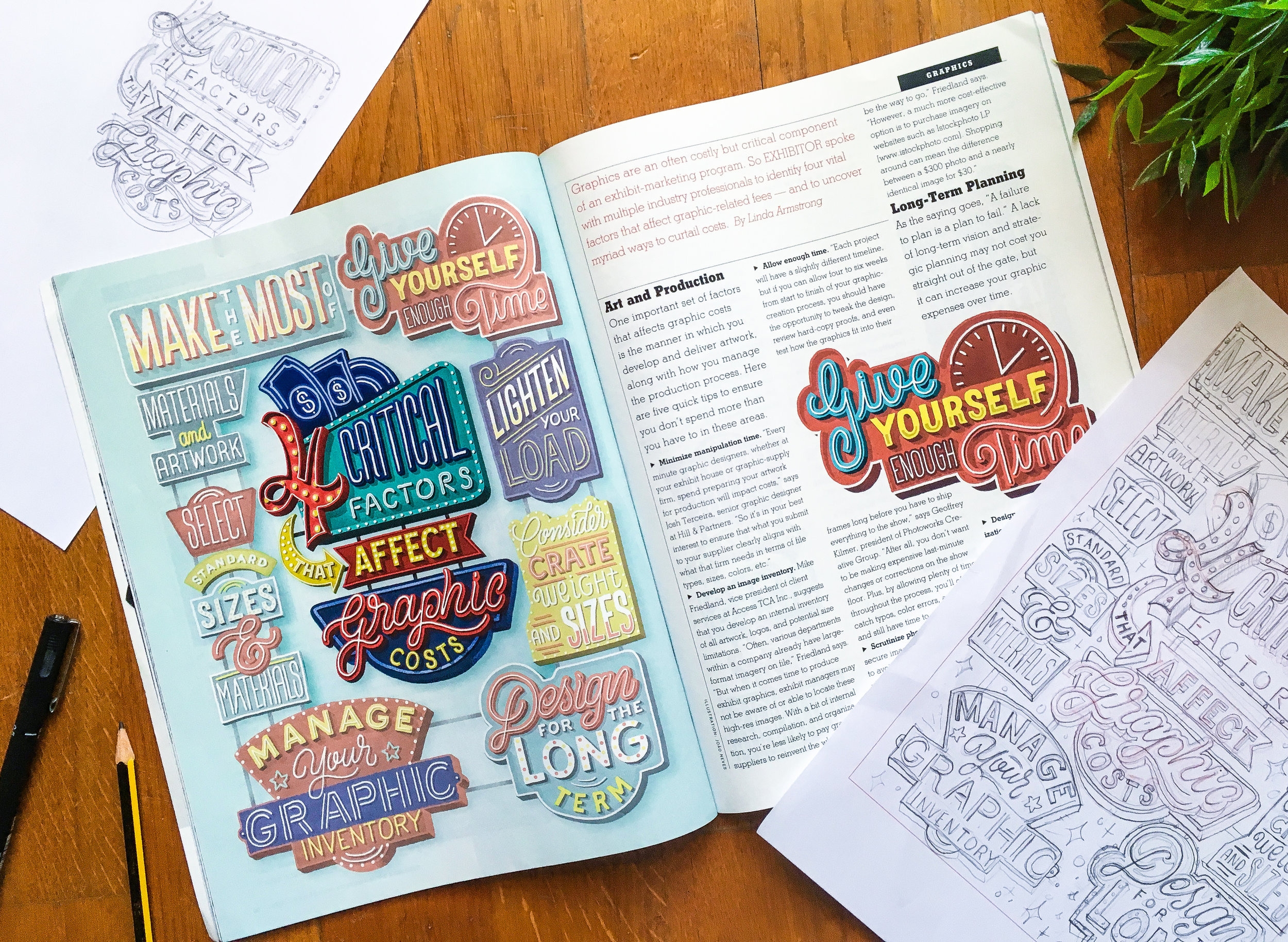
Back in August I was commissioned by Exhibitor magazine to create a full-page illustration for an article titled 'Four Critical Factors That Affect Graphic Costs'. The brief was to create a main sign design with the title and then other smaller signs around it. The references were based on work I've done before so I was pretty comfortable with this project.
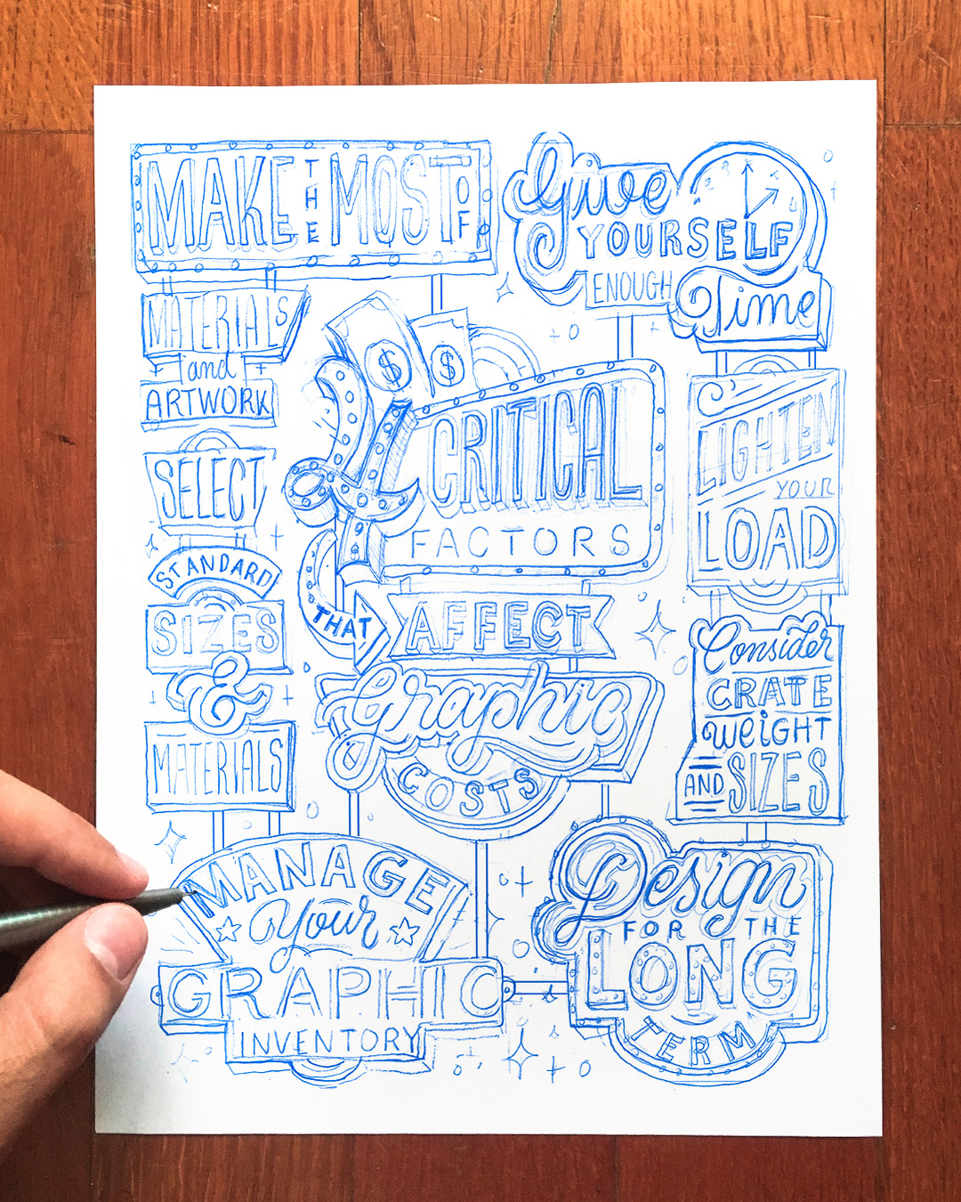
I started this project the same way I start all the projects: with paper and a pencil. It is the best way to let your ideas flow. I came across this layout for the main sign that I really liked.

Now that I had the sketch for the main part of the illustration what I had to do was to draw the other 7 signs around it. I tried to play with different shapes and lettering styles for each one. It was a bit of a challenge to fit everything on the limited space so this part of the process was based on trial and error.
Ok, now the sketch is done and approved. How the heck do I turn this into the final illustration? There are a couple of ways you can do that.
Even though this was going to be a digital Illustration, I really wanted to keep that hand drawn look so what I did was to hand draw all the shapes I would need to build the sign later in Photoshop. You can also make this using vector software like Illustrator but that would look too digital which wasn’t the vibe I was going for.
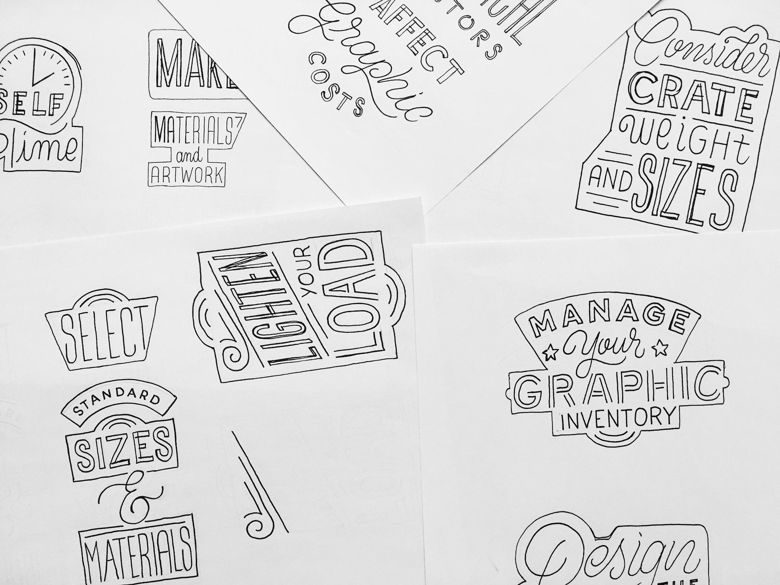
With all my elements already drawn I was ready to move to the computer, I scanned my pages and Imported them Into Photoshop.
I really enjoy working in black and white first. ft helps me focus on the shapes and the composition instead of the colours. It’s a bit hard to explain what I did here but basically I filled the shapes and added dimension to them. I like to use expand and contract (select-modify) with my selections in Photoshop - you can do a lot with just a simple line selection.

I repeated the same process for all the other signs. It was really time consuming and it took a lot of patience but I enjoyed every second of it.
One of my favourite parts of the design process is to add color. I wanted this illustration to be colourful and inviting, but that doesn’t mean you should splash all the colours you can think of. I limited myself to use only 4 main colours (red, yellow and two shades of blue). The more you have the harder it will be to match them.
I also didn’t want the signs to look flat so I added texture to them. I like to use a simple brush with circles and with the scatter and spacing option activated. That is also a great way to add more contrast to the shadows.

The final file had 314 layers and my computer close to melting but I had a blast working on this piece! There are so many ways you can work and that’s what I love about peeking at other people’s process. There are always shortcuts and tips you can learn from other people and I hope this added some value to you! Thank you for reading :)