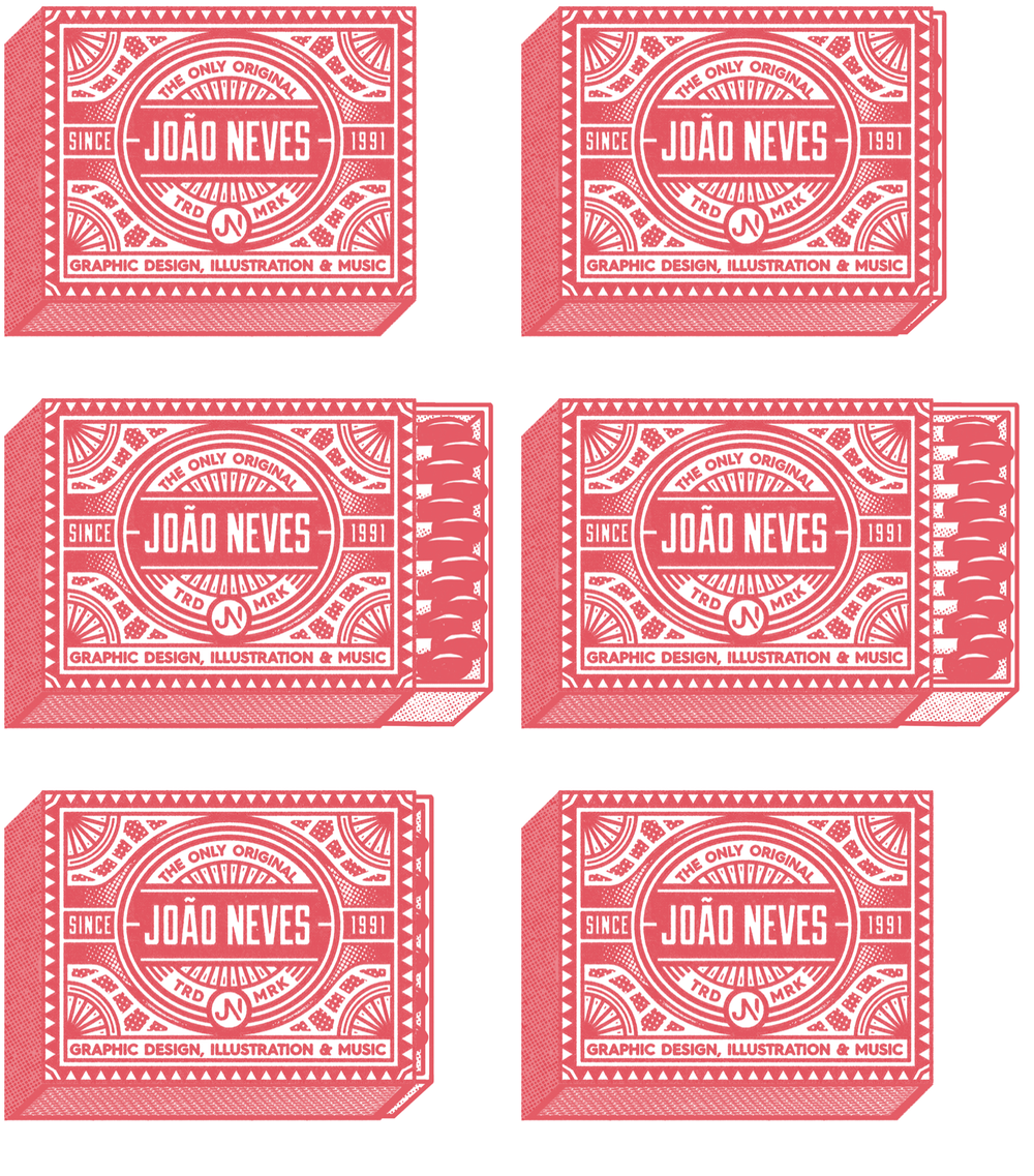
I had the pleasure of being interviewed for the second issue of the new Kodak magazine titled Kodachrome. It is the perfect publication for anyone who loves art, film and analog culture.
Thought it would be cool to post the full unedited version of the interview for anyone who's interested to learn more about my work, process, inspirations and my matchbooks project.
- What’s your design background? How did you end up working as a visual creator?
I’ve been working professionally as a designer since 2012 but I remember being drawn to visual language from a very young age. I've always liked to explore different mediums, from photography to videos and painting. I found that graphic design was the field that I felt more comfortable and interested in, so I decided to delve into it a bit further.
- What inspiration / influences have fuelled your work in general? And where do you go for fresh ideas?
I found that a lot of my inspiration comes from memorabilia. Everything that came from the 40s and 50s is eye candy to me. There is something very special about graphic design during that era: the type was so adventurous and expressive and the colour palettes were bold and bright. Those characteristics really resonate with the type of work that I like to do but I always try to approach it with a modern twist.
It’s cliché to say it but ideas can come from everywhere. Something as mundane as a movie line can be the catalyst to a new artwork or a subway ticket can spark a new layout idea. The important part is to turn those ideas into something unique and tangible, because ideas are worth nothing by themselves.
- What drew you to matchbox art? Why did you want to design matchboxes in 2016?
Unfortunately it’s pretty rare to see them nowadays but I always loved the concept of taking a souvenir matchbook from a restaurant or any other place. It serves a double purpose: it reminds you of that moment and you can light them up! I was also intrigued by the fact that each one is so special and unique even though they are really small. That made me want to explore them, specially because I’m not used to design for such a small scale.
- What research did you do? Did you speak to matchbox collectors, or just get Googling?
I definitely did a bunch of googling and that lead me to amazing online collections. It made me happy to see that a lot of people have this same passion and decided to share their collections with the world. I also discovered that there is a name for people who collect match-related objects - phillumenists! The internet is an amazing place but I also found some great local references in a flea market.
- What do you like best about the matchbox designs of years gone by?
Old matchbook designs are the perfect aggregation of everything that made me fall in love with this field in the first place: great compositions; strong colours and wonderful typography. It’s amazing to think how creative some of those artists were, specially taking in consideration the lack of resources back then.
- What principles inform the best designs, in your opinion?
Any design can only be good if it’s purpose is served. You can have the most beautiful and intricate bathroom sign, but, if no one can understand what it says, than the message was not clearly communicated. This thin line between form and function is what makes a design great and finding the balance between them is one of the most challenging but also rewarding parts of the design process.
- When you started your own designs, what was your creative process?
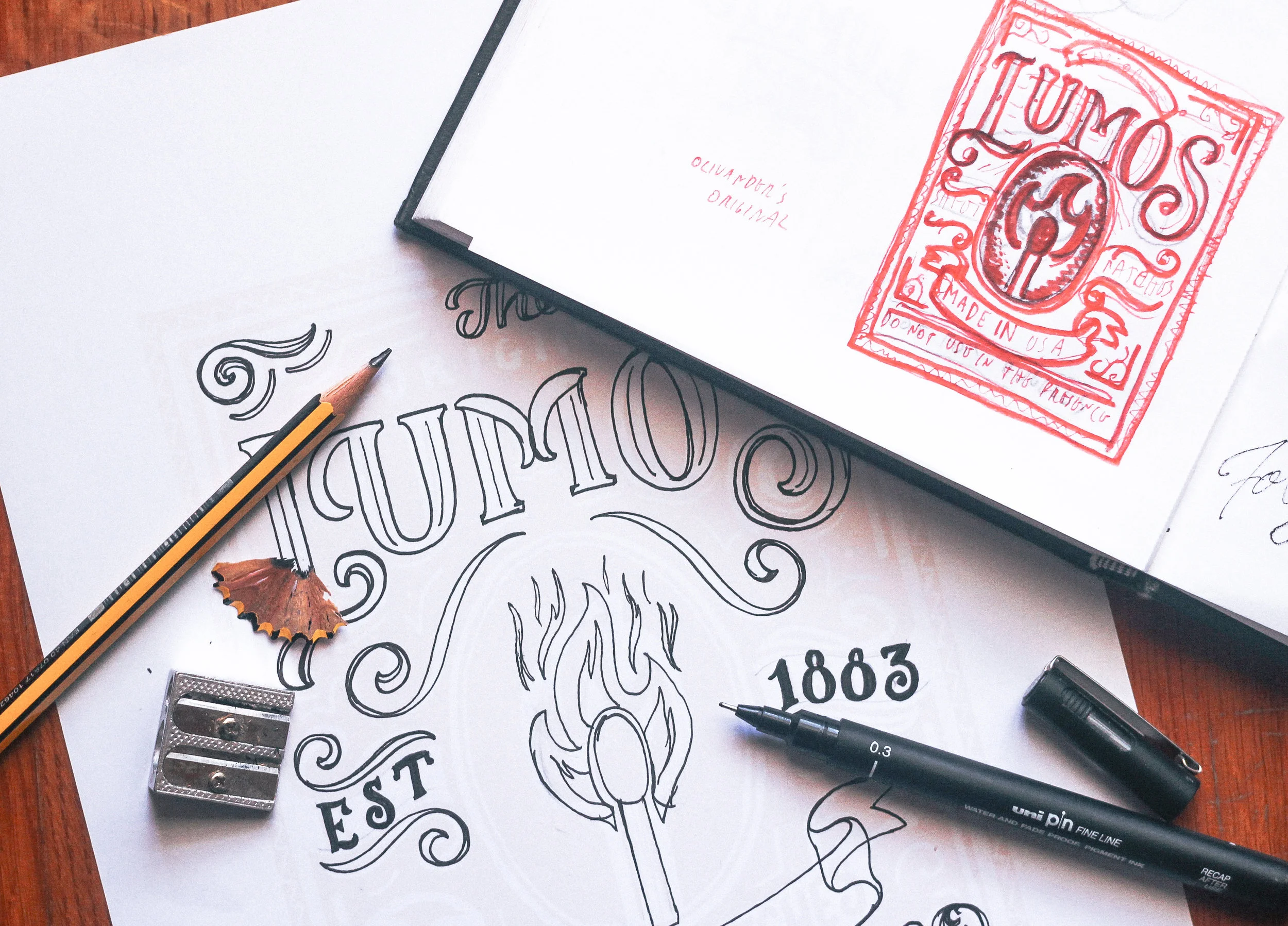
This was a self initiated project so I had the freedom to make up fictional concepts for each matchbox. I’m a very visual thinker so I picked names that I knew would look good or had specific characters that I could play with. After coming up with the concept and figuring out all the elements I started drawing some sketches. Sketching is really important because it can show you quickly if something works or not. I try not too spend too much time on details because it's too easy to get stuck in them and that doesn't really help you at this stage.
When I’m happy with a sketch I start working from the main element and then build around that. Most of the times I design in black and white and leave all colours for the last part of the process. If a design works well only in black, it will certainly look good with colours, while the opposite isn’t always true.
- What challenges did you come up against? Did you do a lot of designs before settling on the final selection?
I made a lot of sketches for each one but only picked one solution for the final design. The most challenging part was definitely working for such a small format - it’s an interesting process trying to find the best compositional solution with such a limited space. It made the process more demanding but also interesting.
- One of our key themes for this issue is how constraints can be a real catalyst for creativity. How do you think this relates to the world of matchbox design?
If you work in any creative area you know it’s hard to come up with the best solution when the brief is too wide. That is why I like to put constraints when that happens. People always say “think outside the box” but you should still put another box outside that first one. The fact that I was working with a very limited space made me approach the process in a different way which lead to new solutions I wouldn’t had found otherwise.
- What do you like about designing for matchboxes, compared to other outlets for your work?
For this project I specially enjoyed the process of recreating the feeling that these old designs capture so well. My favourite thing is making things perfectly imperfect and this was the ideal opportunity for that. Sometimes one colour can bleed into another and create a third one; other times it might be faded on the edges - there were endless opportunities where I was able to play with this duality.
- Anything else you’d like to share with the world?!
Of course! First I want to thank for this opportunity to share some of my work and talk a bit about it. Secondly, I want to encourage everyone to pay more attention to small things and to the details. Matchbooks are only one of the million examples from where you can draw inspiration from!
Hope you guys enjoyed reading this!


